November 19, 2026
Coca-Cola: the new look of Zero Sugar
Coca-Cola
The challenge: how do you show that something has changed, while making clear it's still the same?
Coca-Cola Zero Sugar got a new design. New packaging stands out, but it also raises a question: does that mean the taste has changed too? Coca-Cola wanted to show the redesign to a broad audience while making it clear that the taste had stayed exactly the same. A young, urban audience in particular needed to get to know the new look.
The strategy: one message on one big format
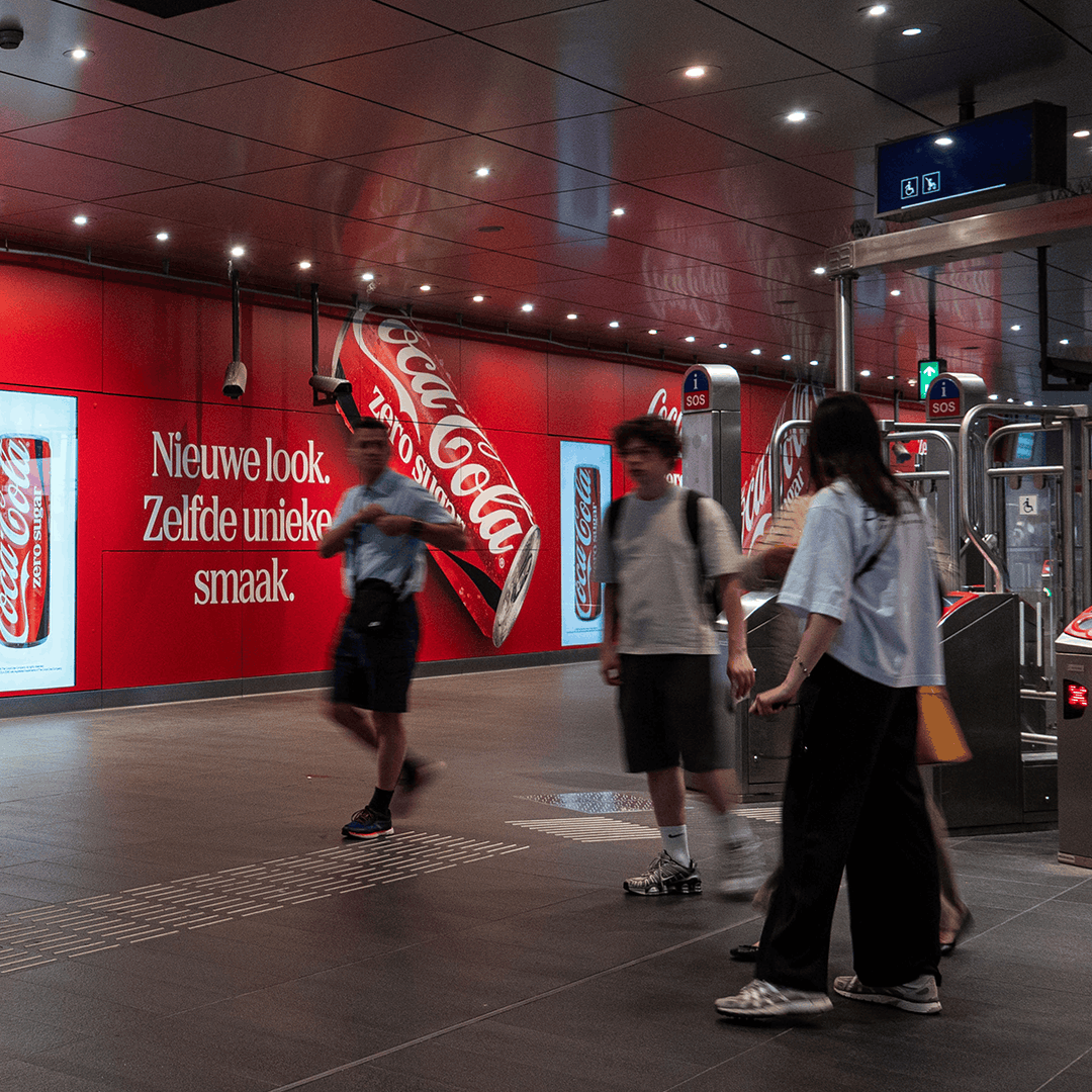
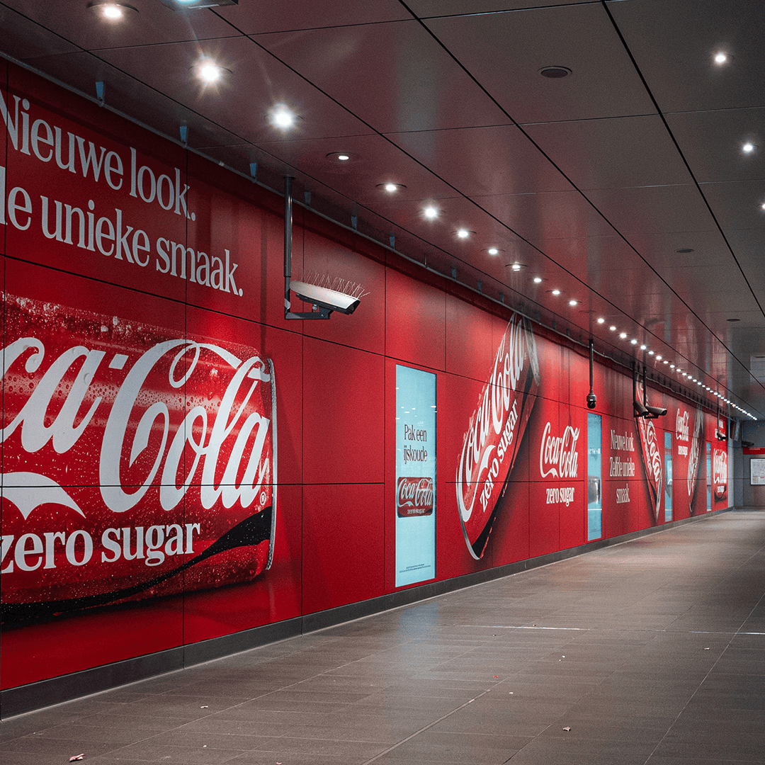
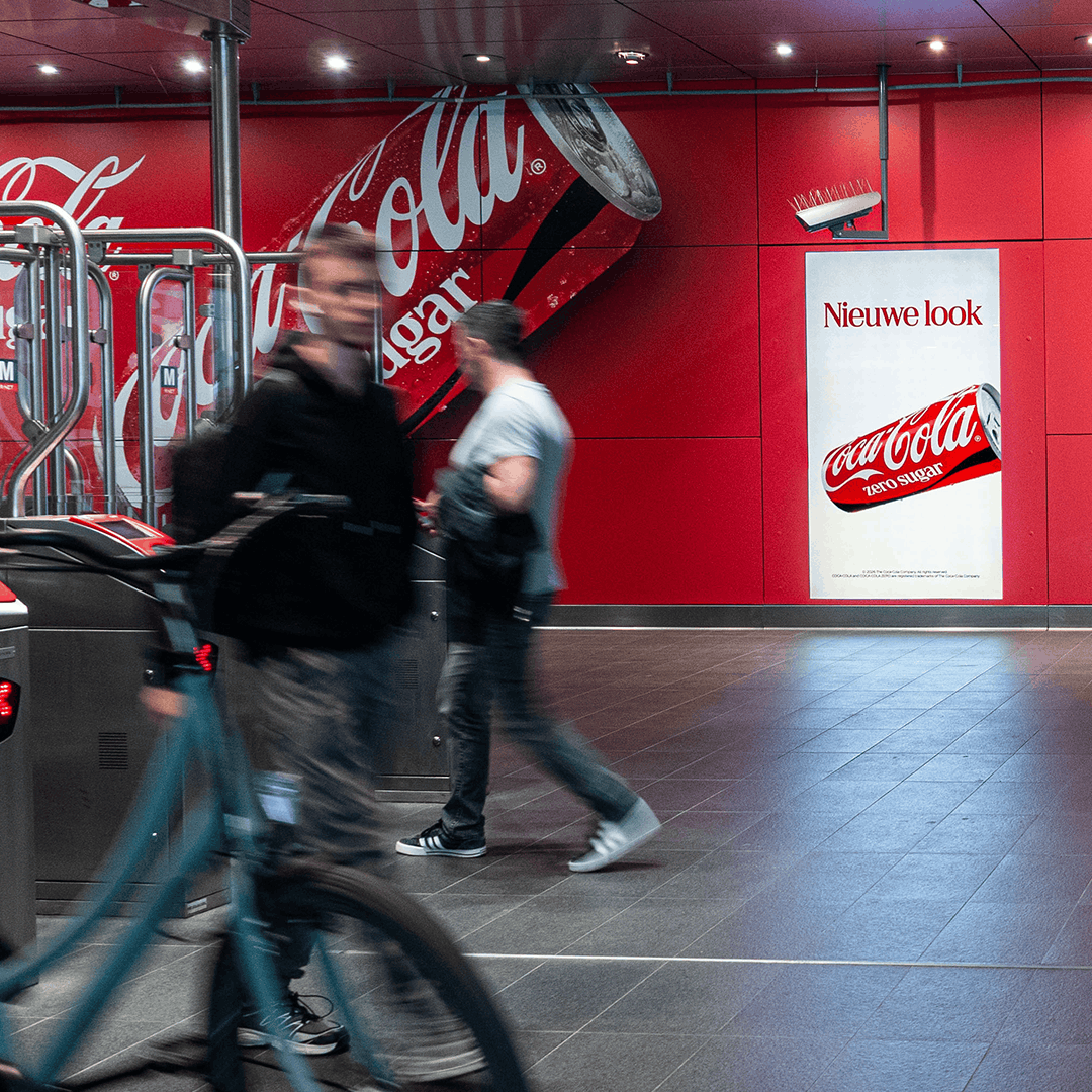
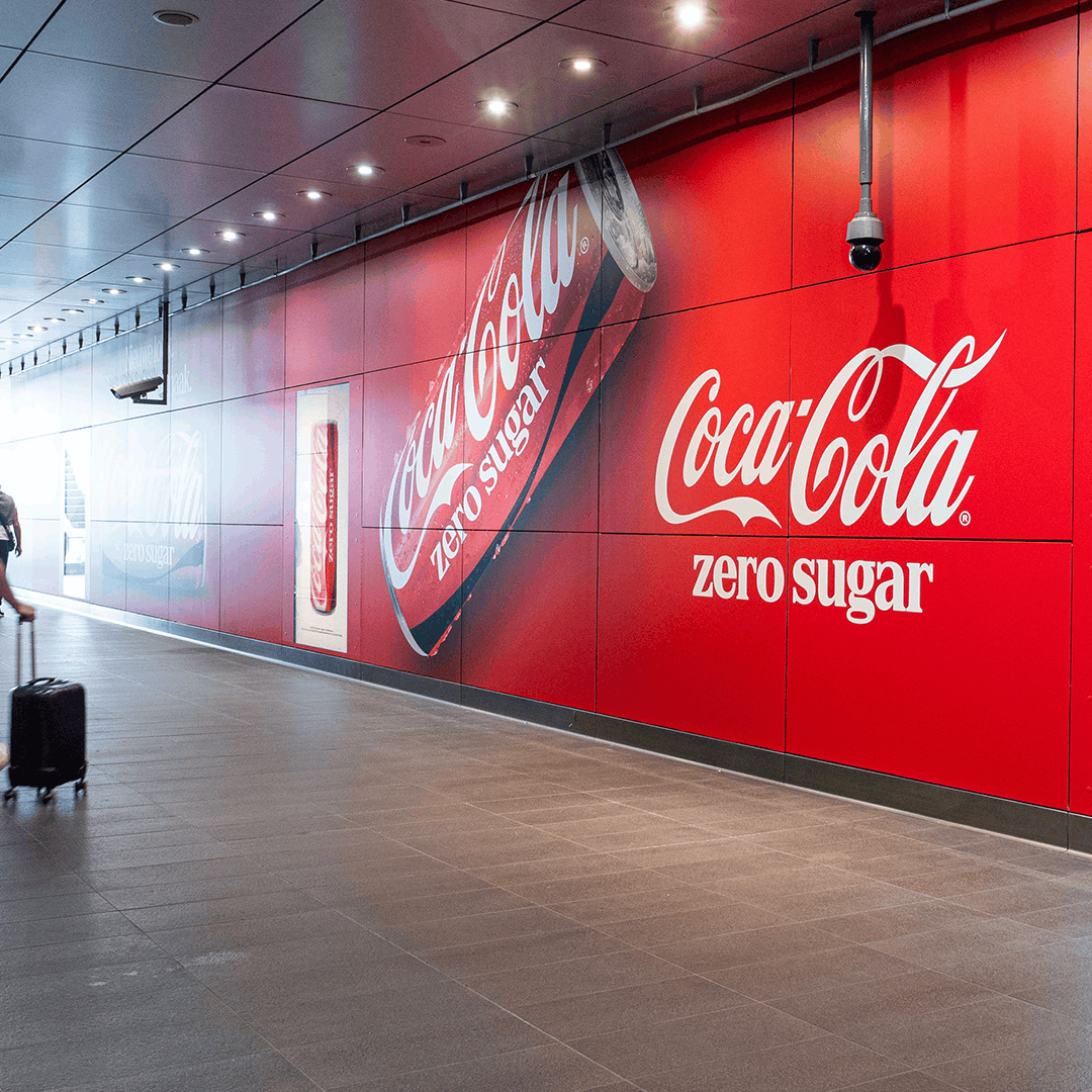
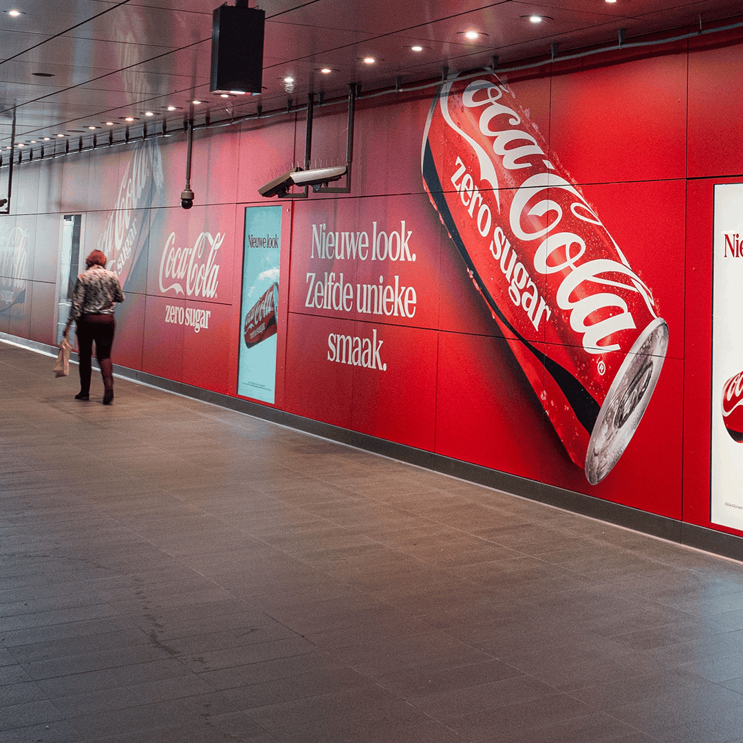
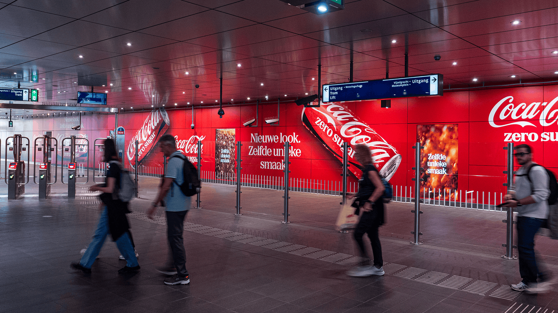
Coca-Cola opted for one powerful placement in a highly visible spot: the Vijzelwall at Vijzelgracht station, a large-format special build in the heart of Amsterdam. The message was short and clear: Same unique taste, new look.
- Vijzelwall: a 41-metre-long wall with integrated digital screens, big enough to show off the new packaging in all its glory.
- Introduction week: the campaign coincided with the student introduction week, a period when this audience is out and about across the city.
- One message: same taste, new look. Clear at a glance, even to passers-by.
Het result: a new look Amsterdam couldn't miss
With the Vijzelwall, Coca-Cola gave its new packaging a large-scale announcement right in the centre of Amsterdam. Thanks to the location and timing, a young, urban audience saw the new look at a moment when they were out and about in the city.
- Big format: 41 metres to show off the new packaging.
- The right moment: visible during introduction week, when students are (re)discovering the city.
- A clear message: the new look and the unchanged taste in a single sentence.